Strategies for Neurodivergents: An ADHD Brochure
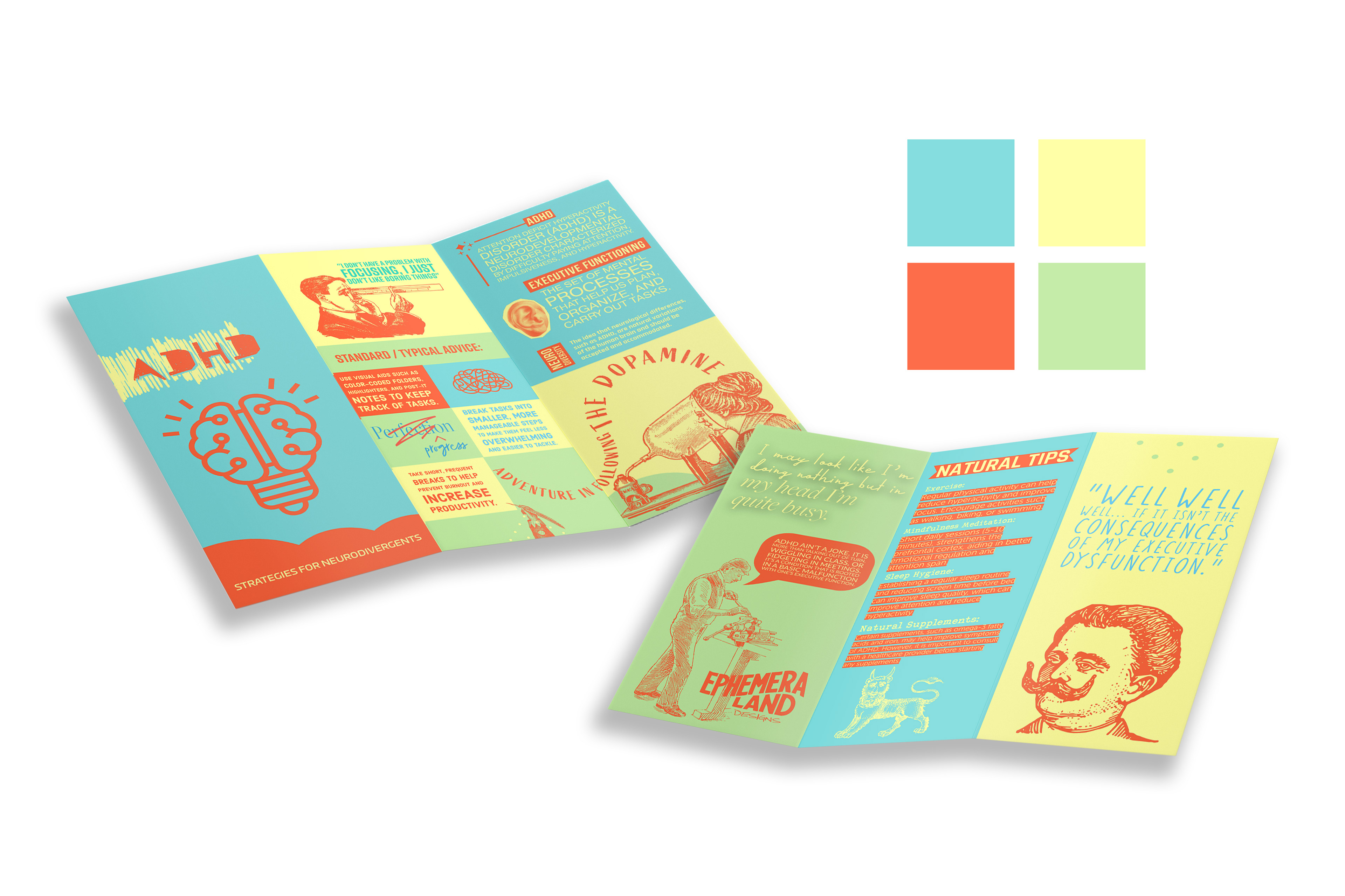
Designed as a six-panel trifold, the brochure balances informational clarity with expressive visual storytelling.
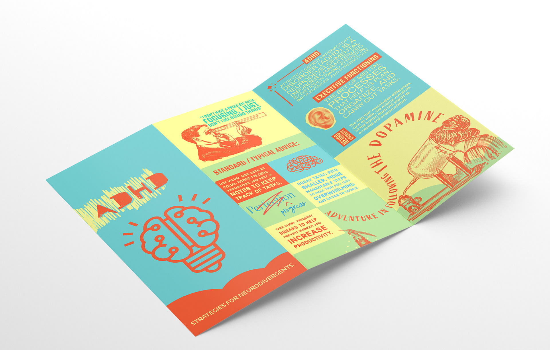
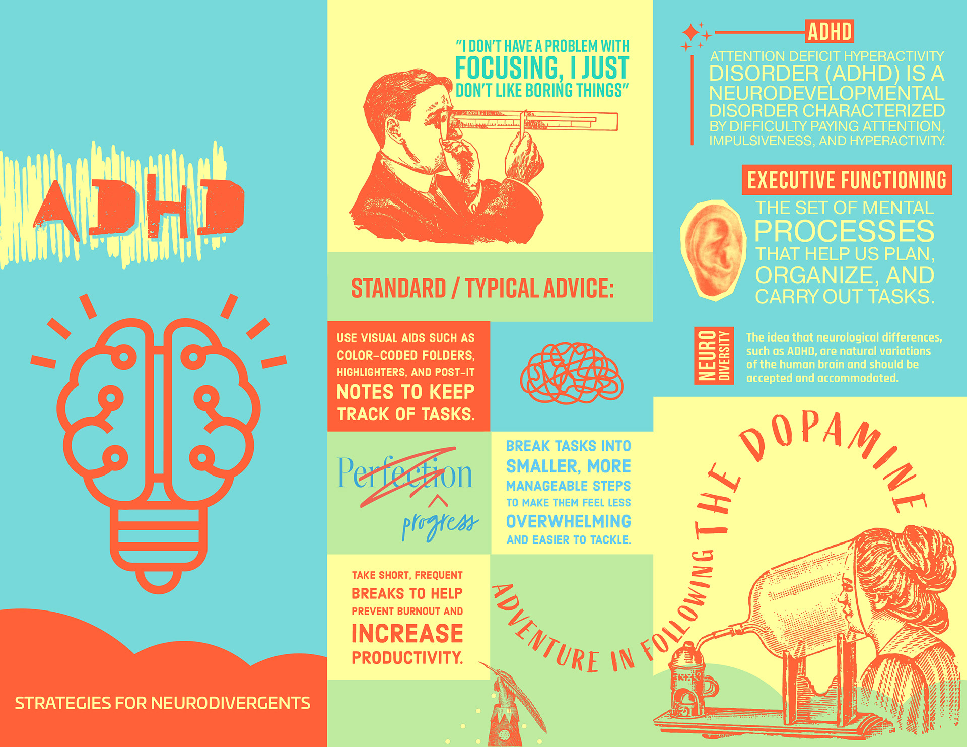
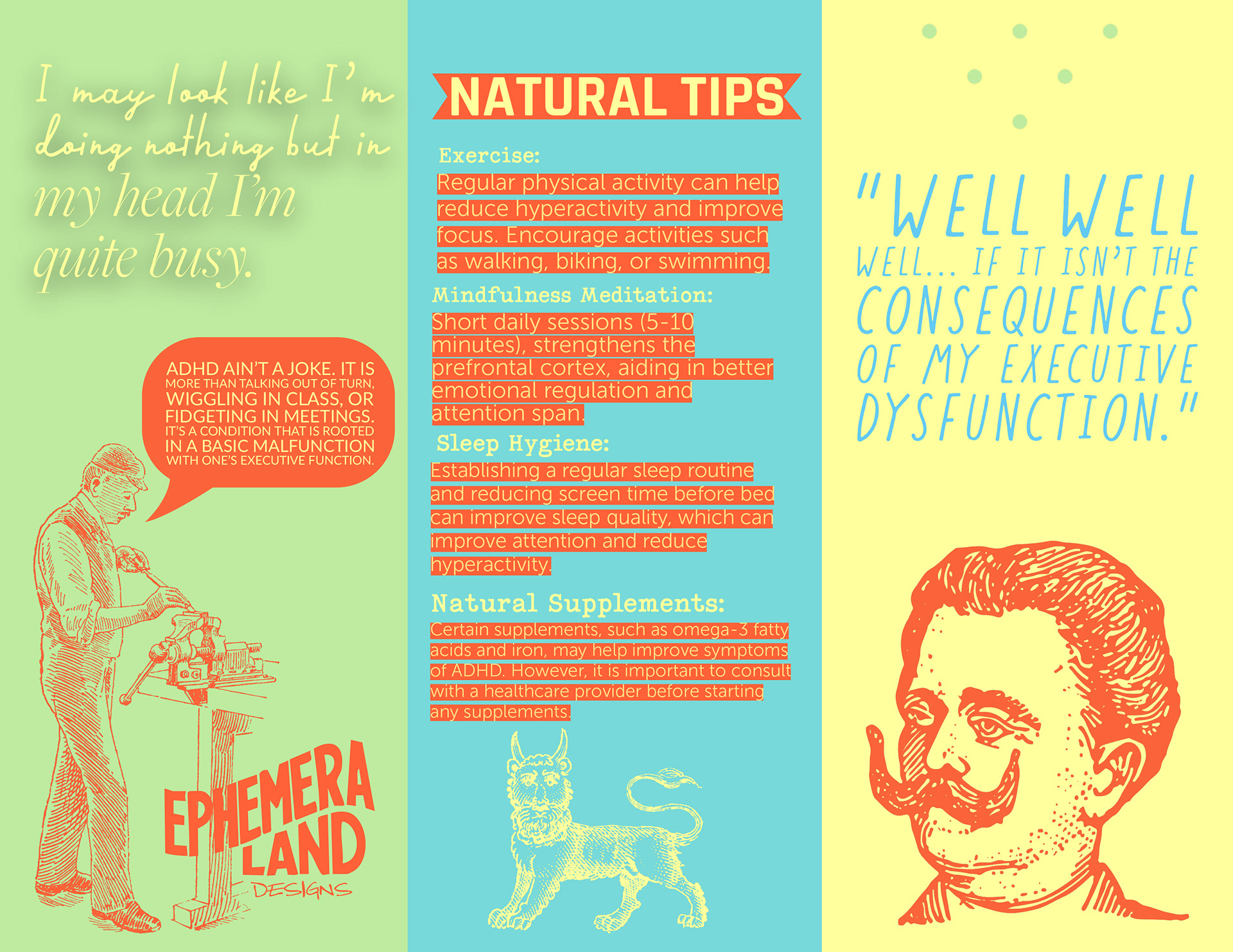
The exterior introduces ADHD through bold, simplified language and contrasting color blocks. The tone blends humor and validation to challenge common misconceptions about executive dysfunction.
The interior panels organize educational content into digestible sections, including executive functioning, common advice, and actionable strategies. Clear visual hierarchy and color segmentation guide reader navigation.
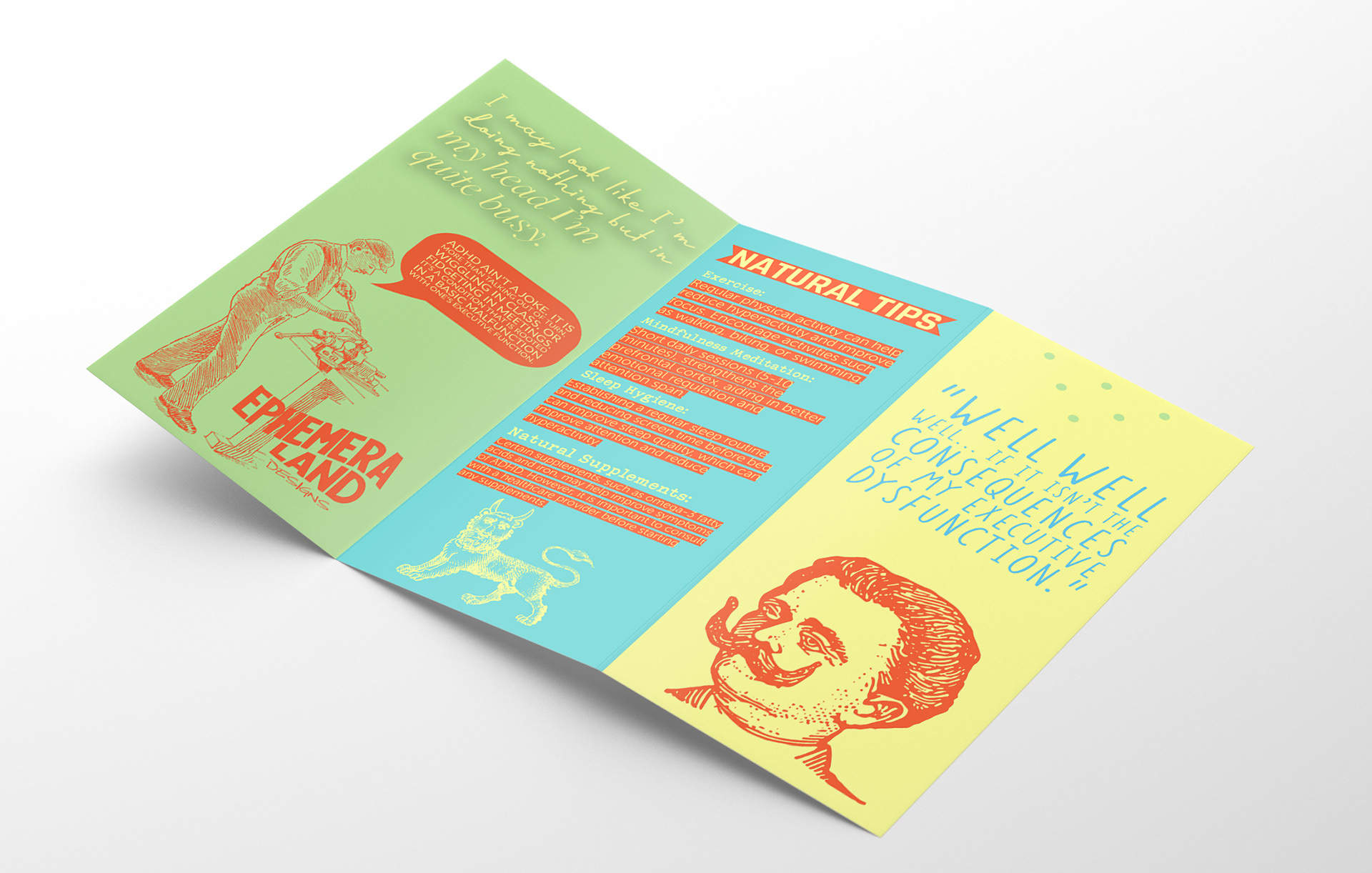
Visual Language & Illustration: Vintage-inspired illustrations juxtaposed with modern color blocking create a visually dynamic but structured layout. The combination reinforces the message that neurodivergence exists across generations and experiences.
Color System: A high-contrast palette of teal, citrus yellow, coral, and mint green was selected to evoke energy and stimulation while maintaining readability across print surfaces.