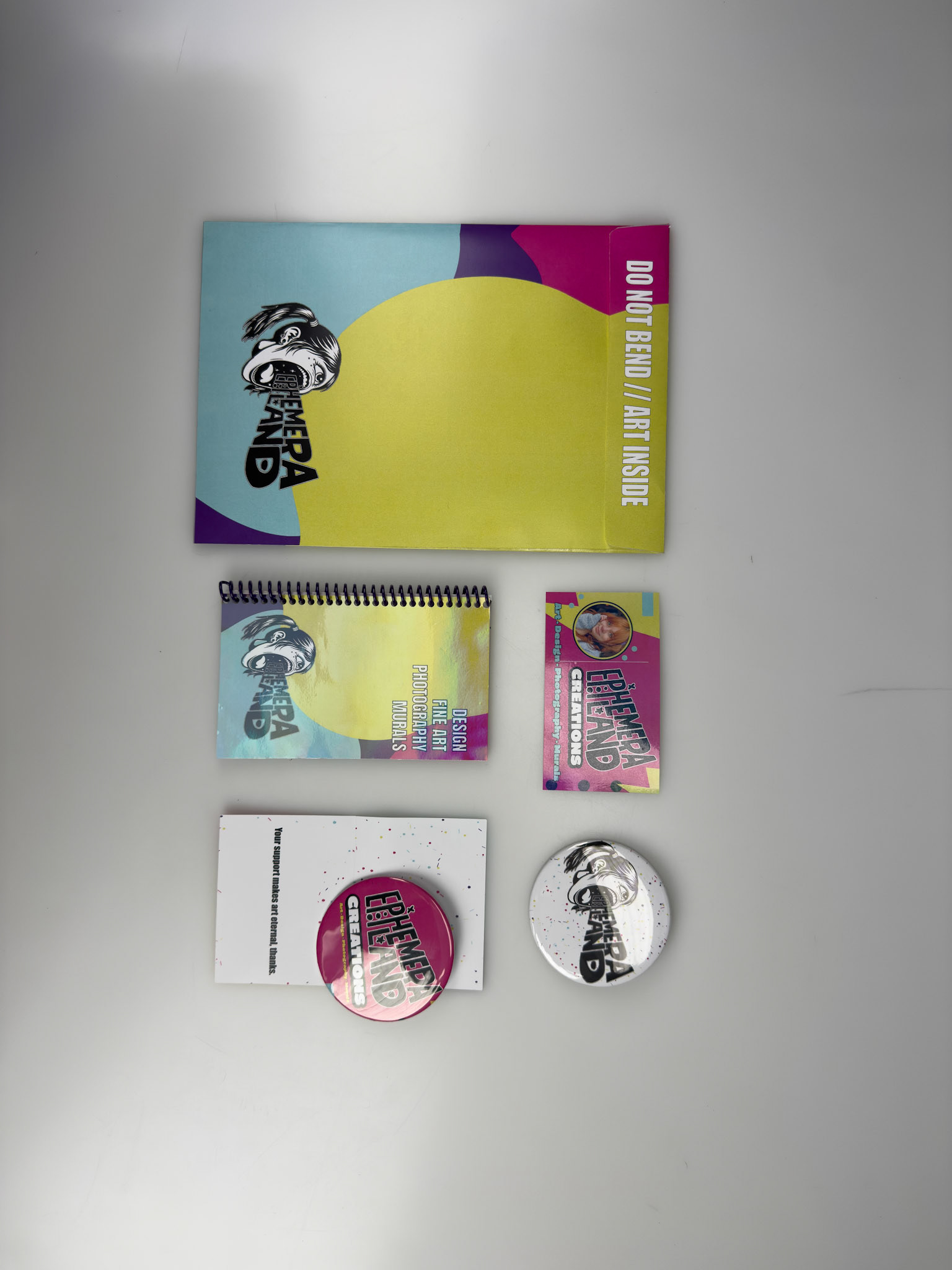
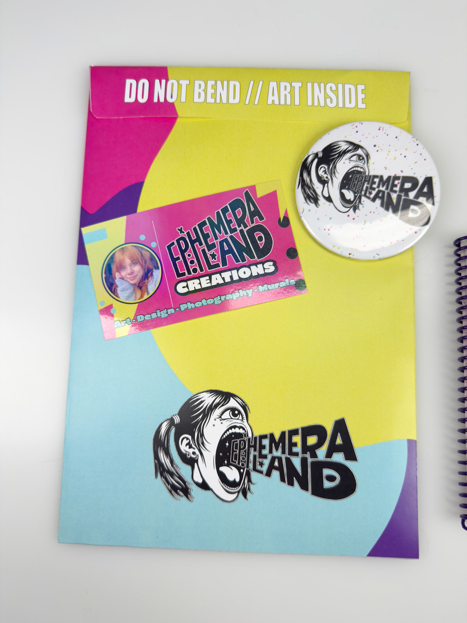
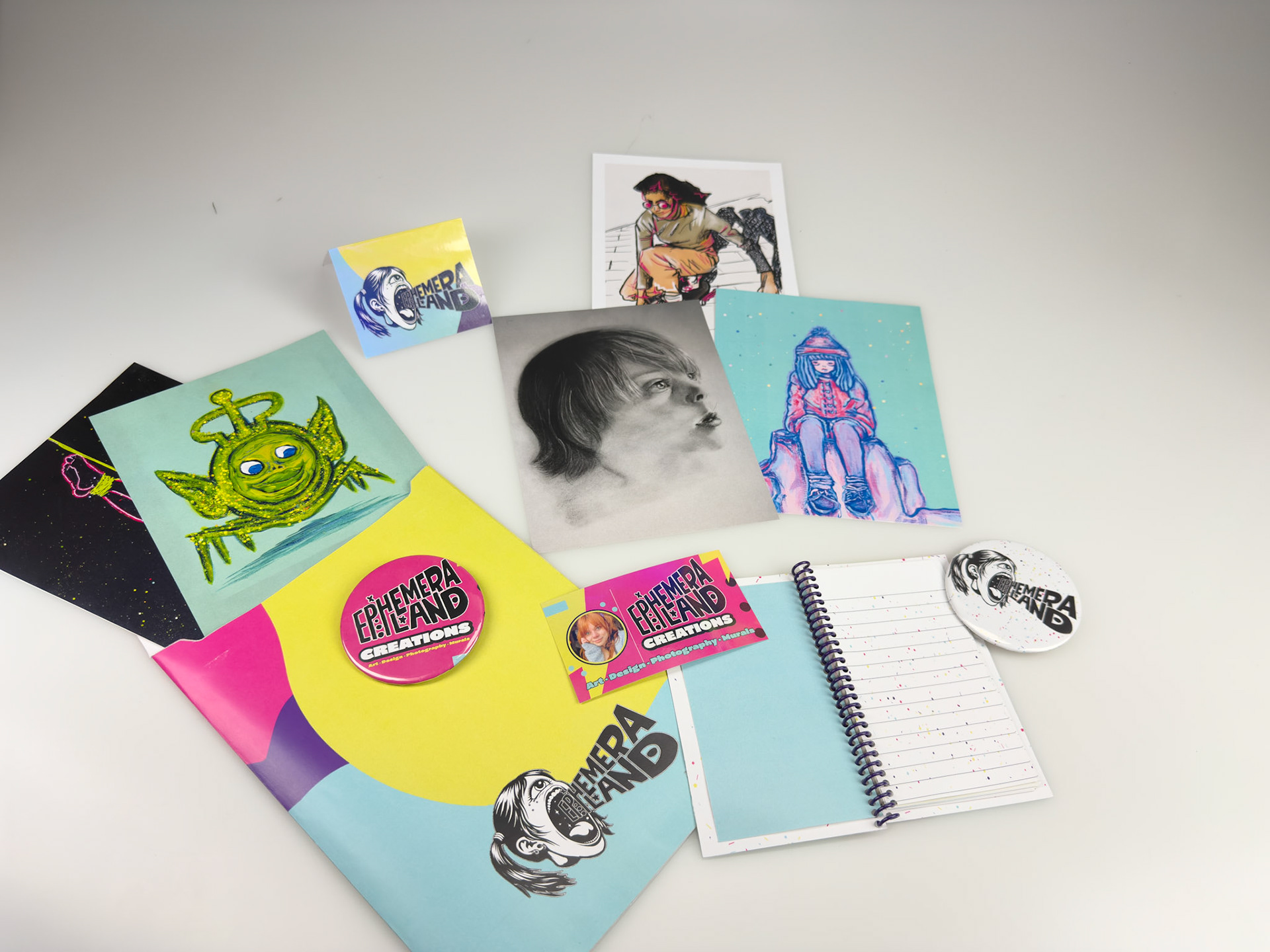
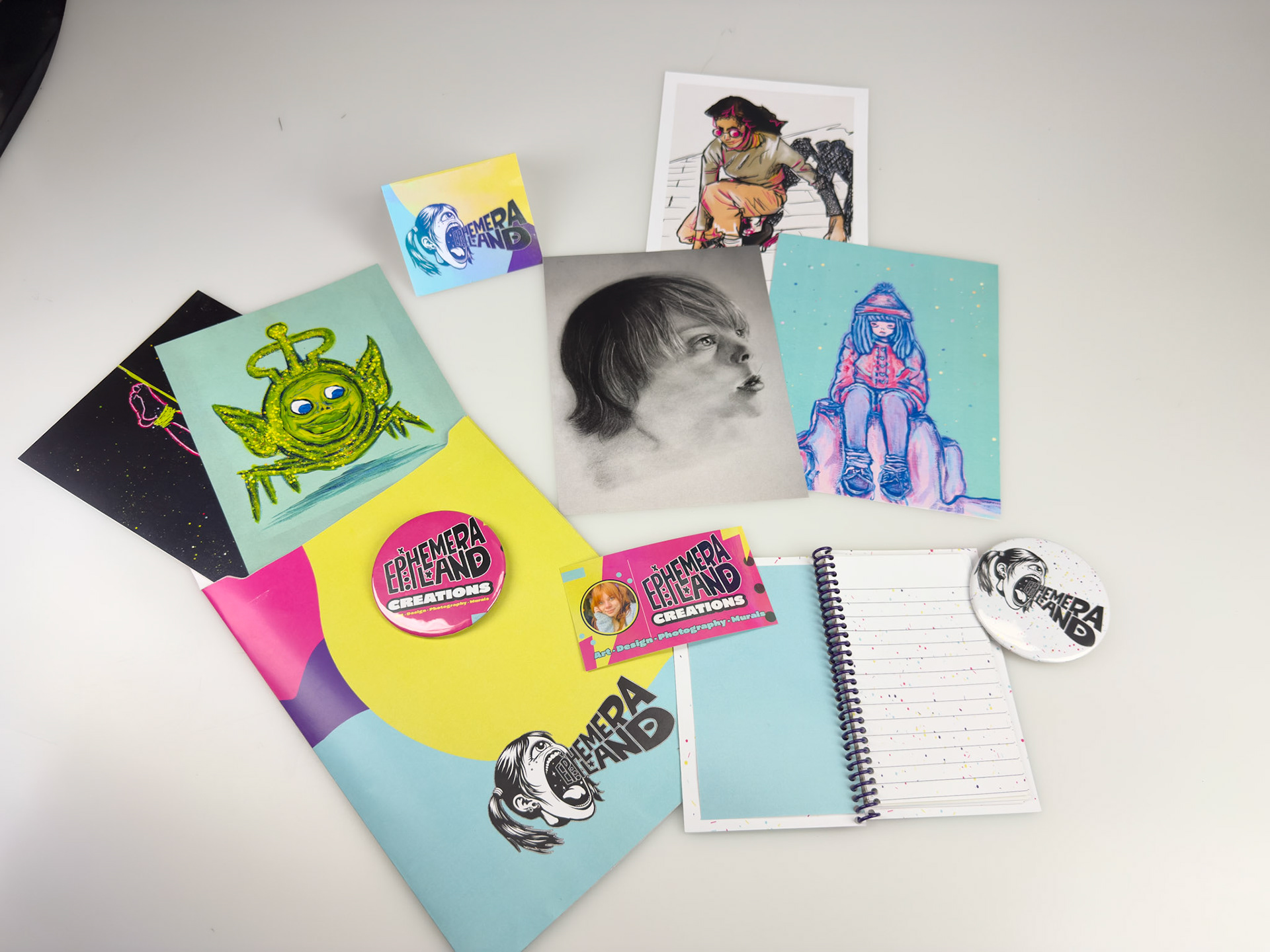
Brand adjectives: Surreal, Defiant, Reflective, and Electric.
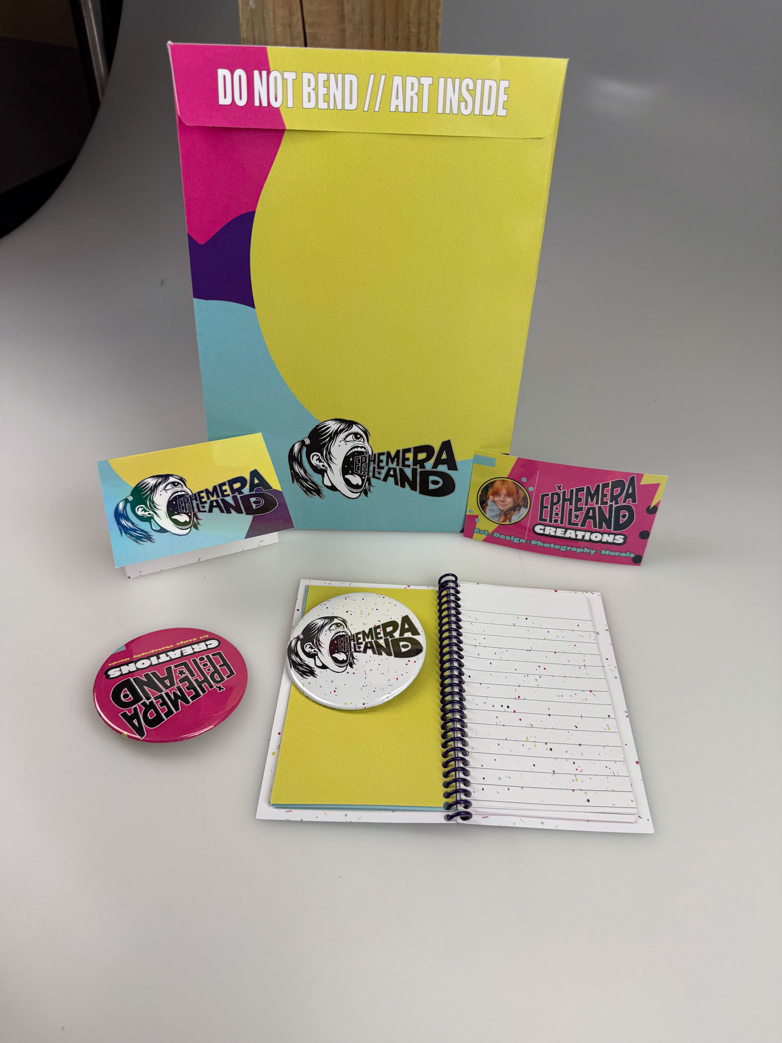
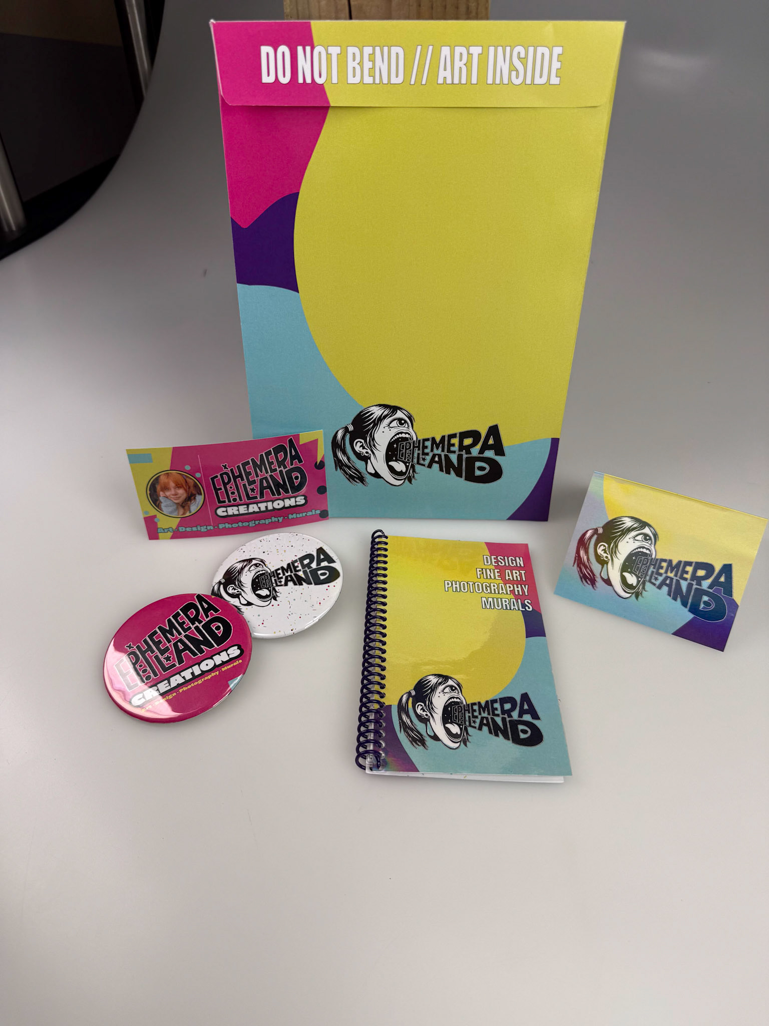
Ephemera Land is my creative ecosystem, a fusion of design & art.
created to exist between worlds: the gallery, the street, and the subconscious.
My brand identity needed to feel raw yet intentional since it represents my visual manifesto as an artist and designer.
so its equal parts surreal, defiant, reflective, and electric.
Concept
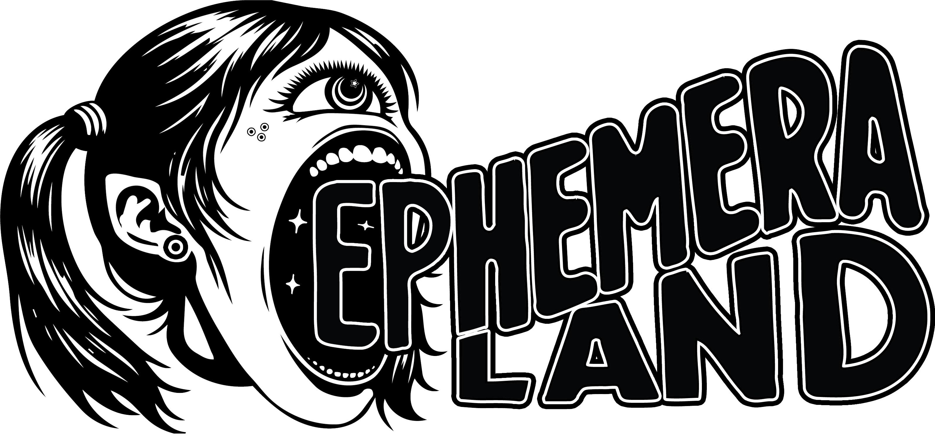
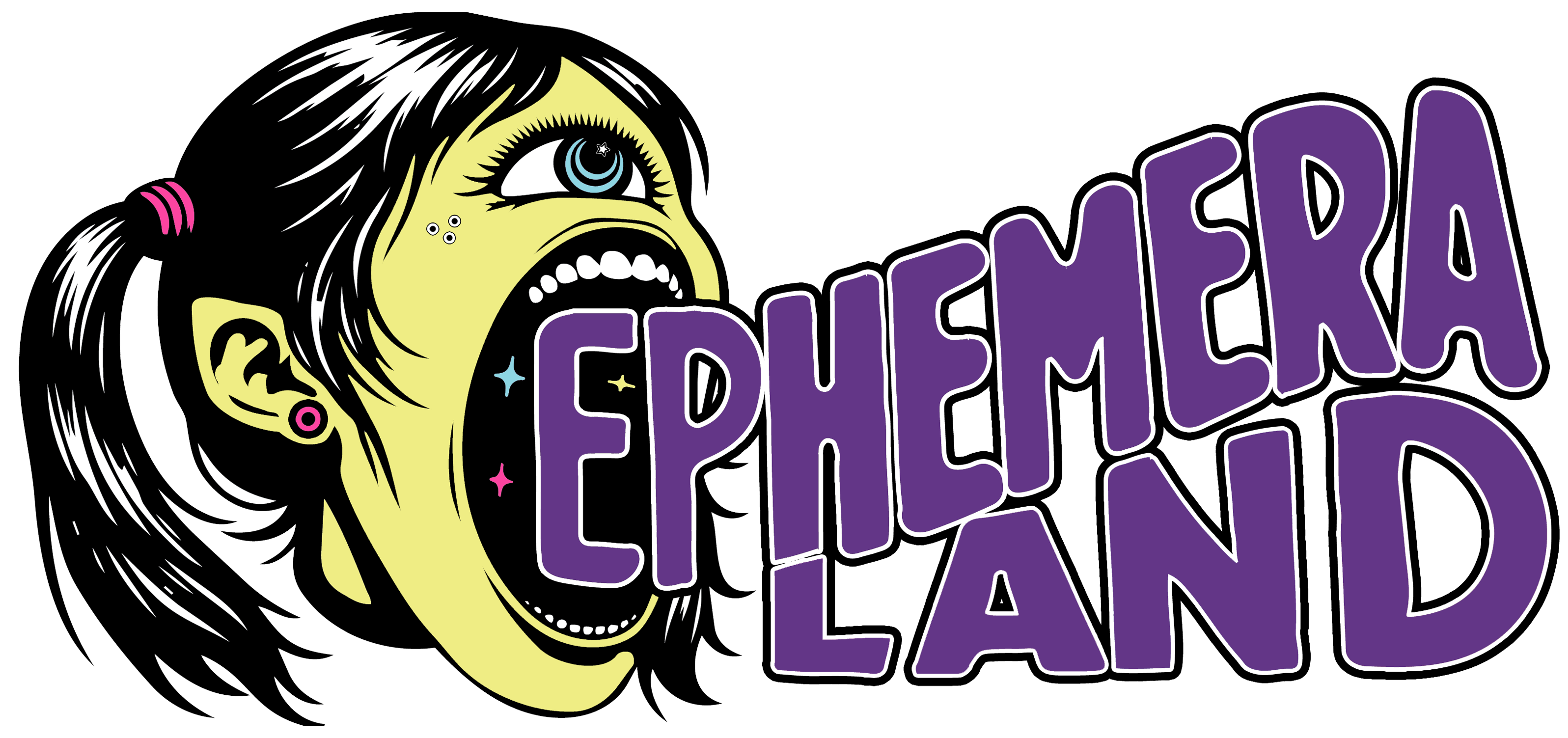
Ephemera Land channels the fleeting, electric nature of creativity: the way ideas flare, mutate, and vanish. Every element, from the chaotic splash patterns to the bold color fields, reflects the tension between permanence and decay. My screaming cyclops logo anchors the brand in emotion: catharsis, rebellion, and weirdness.
Design Choices
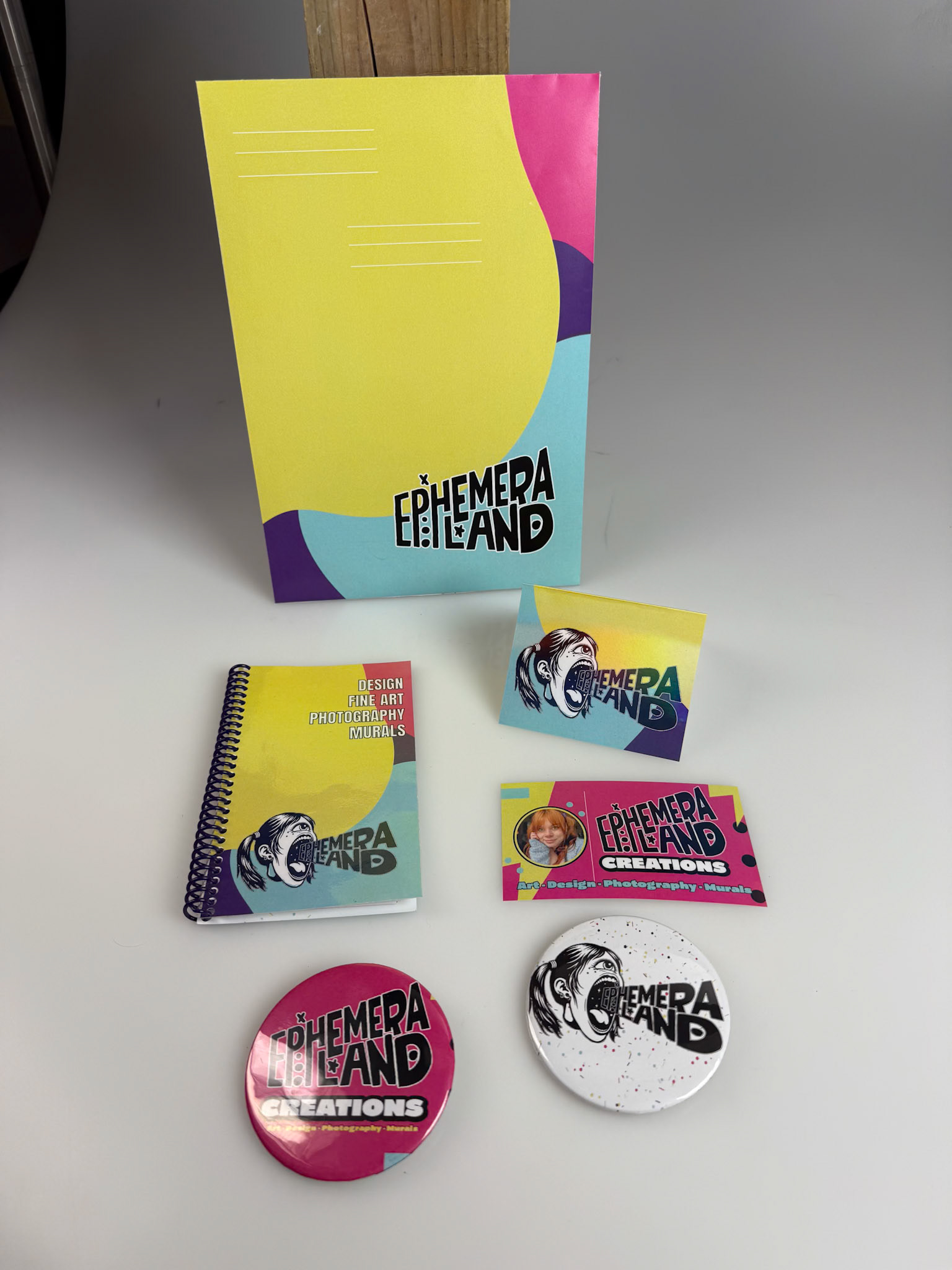
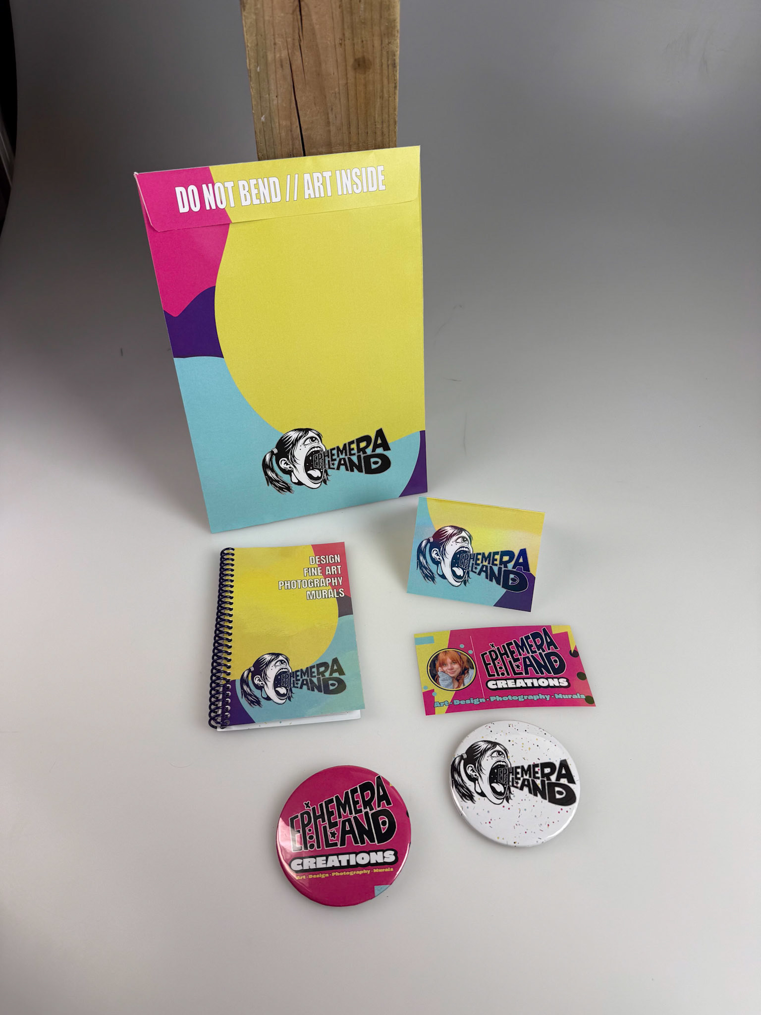
The color palette leans into retro-futurism and sub-cultural vibrancy, combining acid yellow, magenta, cyan, and violet
evoking zine culture and a post-punk aesthetic.
I decided to have the typography be bold, condensed, and grounded to balance the chaos of the visuals with a little structural clarity.
Each item was designed to feel collectible, like a small rebellion against mass production, hand made art by a human…ish.